Color Meanings
If you read the post from Monday, we covered the science of color. I covered how different colors work together, and the science behind how they work. It’s great to take a scientific approach to design, but you can’t forget the impact of designing with emotion. Culture and emotions play a vital role in the impact of design hands when it is received. If you can grasp which emotions are tied to certain colors, you can leverage this to make your designs much more powerful. Let’s take a look at different color meanings and the emotions behind colors.
Red
When you think of the color red, you think of heat and passion. Red is the color of love, which is displayed in abundance on Valentine’s Day. The other side of the coin, is that red also represents danger, anger, and blood. Red is one of the most important colors in existence, because of the powerful emotions associated with this color. Read immediately gets your attention, especially when it is surrounded by other colors.
Orange
Orange is most representative of energy. Orange is a lively color, which is also associated with warmth. Orange has less impact than red, but it still gets a lot of attention.
Yellow
Yellow is the color of caution, mainly due to the context in which we’ve seen it throughout many years. Yellow has been used in caution signage, whether it’s a wet floor sign, or a yellow road sign. Due to its cautionary connotation, yellow represents fear, being afraid, and being a coward. When used in bright tones, it represents fun and energy.
Green
Green represents a lot of important concepts. Green is the color of our money system, so it represents wealth. In other countries, where their money system isn’t green, this color doesn’t have such a powerful meaning. Green is also associated with life and living, as well as growth. This is mainly due to the fact that most plants are green to some extent, whether it is grass, or the green leaves on a tree.
Blue
Blue is a powerful color as well. Depending on how you use it, blue can set the tone of an entire design. Luke can represent tranquility, such as a calm sky. Blue can also represent refreshment, like you would receive from a cool drink of water. Blue can also represent cleanliness, due to the fact that you wash your self with water. Darker shades of blue can represent depression or sadness. A color palette made up of a majority of blue tones, can make an image seemed cold or sad.
Purple
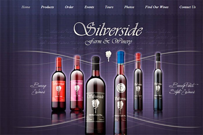
Depending on the shade or tint of the purple that you choose, it can represent distinctly different concepts. A rich purple can represent romance or intimacy. A deep purple can represent luxury or extreme wealth.
While the next two are necessarily considered as colors, you can’t deny their importance in the look and feel of a design.
White
White is mainly associated with cleanliness and holiness. White is seen as being pure and blemish free. That’s why you see a lot of white in toothpaste and soap packaging. White can be seen as soft, such as with cotton, and clouds. White can also be seen as cold, or having a lack of emotions, such as in a sterile laboratory.
Black
Black has a number of different meanings and cultural references behind it. Black can represent evil, death and decay. This is mainly due to the fact that when things die, they turn black and decay away. Depending on how you use it, black can also represent luxury or wealth. This is due to the fact that black has a sophisticated appearance by itself or combined with certain colors, such as silver or gold.
Color Meanings: Conslusion
Understanding the cultural connotations surrounding different color choices can help you to create more effective designs. If you’re designing for companies in the United States, you can follow these guidelines and expect decent success. However, different cultures perceive colors differently. For example, in China, white represents cowardice. In our culture, yellow represents cowardice. This is just one example of how a culture can interpret color differently.


