Color Theory
Color is in everything. Whether you are in awe at a majestic sunset, or you are in the heat of passion at Valentine’s Day, color plays a vital part in your emotions. When you think of certain colors, certain thoughts or emotions come to mind. This is why color is so important in the world of design. Color can bring thoughts, feelings, emotions and even memories flooding to you. It’s important to understand the importance of color and the role it plays in your designs. How color works isn’t just random, but there is a science and reasoning behind all of it. Let’s take a look at different color models and how they are formed. This will help you to understand color theory and how it is applied to graphic design.
Primary colors
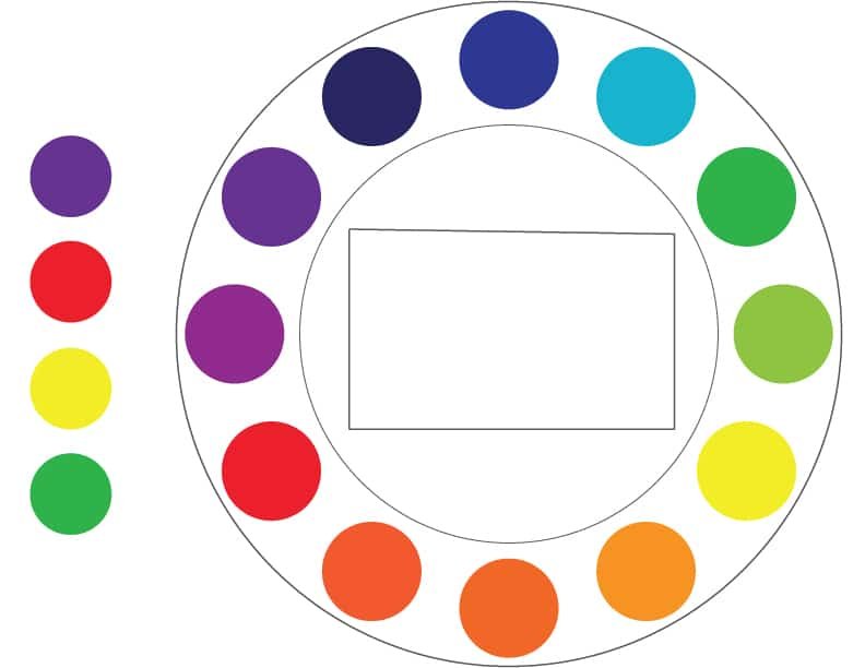
Primary colors are the base colors of which all the other colors are formed. From the mix of primary colors, all secondary and tertiary colors are made. The primary colors are red, yellow, and blue.
Secondary colors
Secondary colors are formed when you mix primary colors together. For example, when you mix red and yellow, you get orange. Orange is considered a secondary color. When you mix red and blue, the result is violet. When you mix blue and yellow, the result is green. Primary and secondary colors both produce a lot of contrast. For example, violet and green have a lot to contrast with each other.
Tertiary colors

Tertiary colors are formed when you mix primary and secondary colors together. This is how you get colors such as red–orange, yellow orange, yellow green, blue green, blue violet, and red violet. These colors have a little less impact than primary and secondary colors. However, when you use primary secondary and tertiary colors together, you can have very pleasing results.
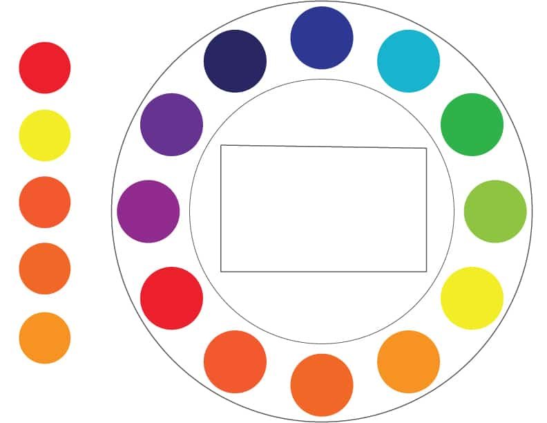
The color wheel
The easiest way to understand how colors interact with each other is to use the color wheel model. Using this model will help you to understand the placement of colors in reference to each other. I will use the color wheel model to show you how colors interact with each other. This visual model places specific colors proportionately across from each other, and can help you to determine which colors to use together. Now, let’s take a look at color combinations.
Color Combination models
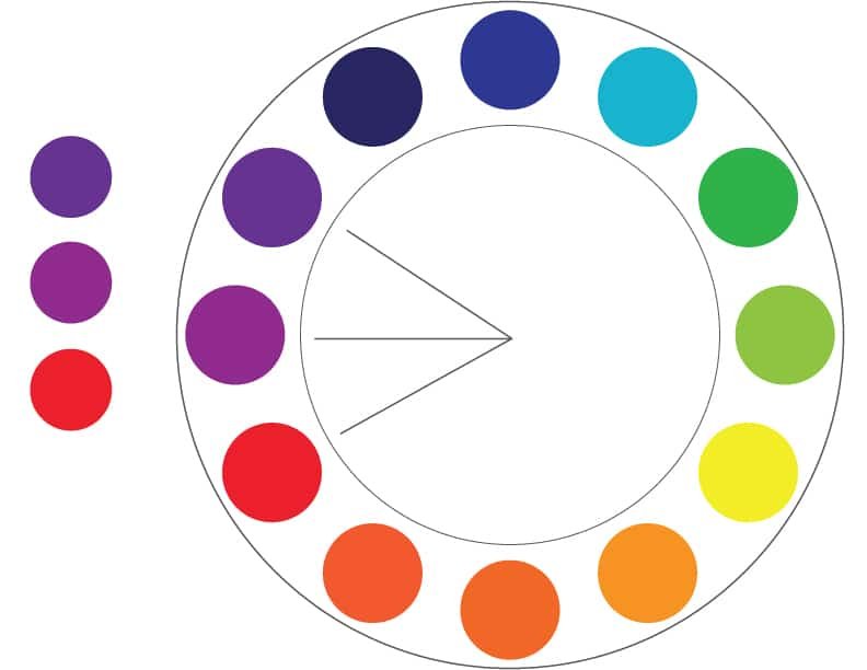
Complementary colors
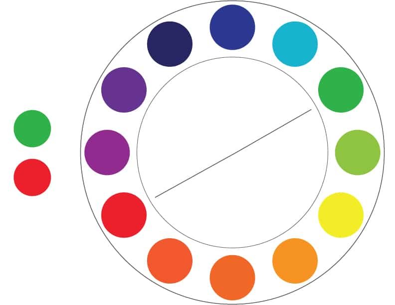
Using our color wheel as a model, you can see which colors are directly across from each other. Colors that are opposite each other on the color wheel are complementary colors. Colors such as orange and blue, red and green, and yellow and purple are examples of complementary colors. If you want a great degree of contrast, a complementary color scheme is a great choice. A quick tip with these is that you don’t want to use both colors at full strength. It would be a good idea to mute one of the colors, or use a tint of that hue.
Split complementary colors
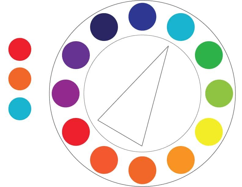
Split complementary colors start with complementary colors as a base. Then, for one of the color choices you substitute the colors on either side of that color. For example, if you chose red violet and yellow-green, the split complementary would be red-violet, green and yellow. These colors work well together and offer a great deal of contrast while avoiding visual vibration. Visual vibration is where the colors tend to hurt people’s eyes when they are used together at full strength. Unless it is done intentionally for effect, you want to avoid visual vibration whenever possible.
Analogous colors
Analogous colors are colors that are next to each other on the color wheel model. This is a great way to create a color scheme with a specific mood. An example of analogous colors would be yellow-green, yellow, and yellow orange. You get a variety of colors that will look great with each other.
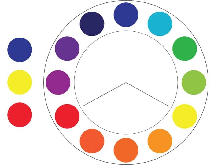
Triads
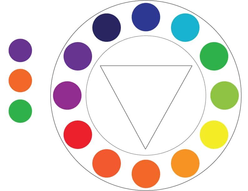
A triad forms a triangle on the color wheel. This means that the colors are evenly spaced around the color wheel. A great example would be blue green, yellow -orange, and red violet.
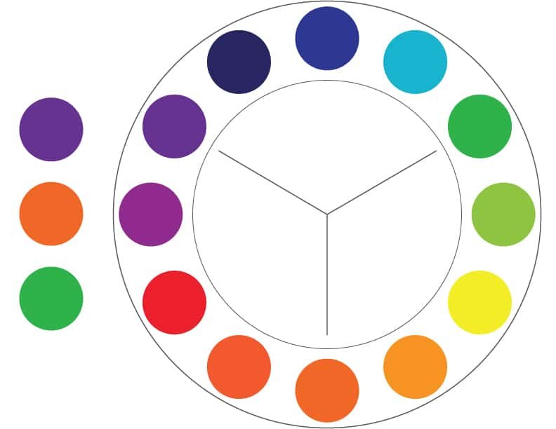
Square colors

Square colors are created by creating a square on the color wheel. The colors are evenly spaced around the color wheel, skipping two colors every time. An example of a square color scheme would be red, yellow-orange, green, and violet. This tends to create fun color schemes with a lot of variety.
Tetrads

Tetrad color schemes are similar to square color schemes, except instead of a square, you use a rectangle for this model. It is almost like a double split complementary color scheme. An example of this color scheme would be violet, blue-green, red-orange, and yellow orange.
Now that you understand how colors work together within the color wheel model, you can create powerful color choices that work well together. However, using these colors at full strength won’t produce the spectacular results that you need. If you want to take your color choices to the next level, you’ll need to understand tints and shades. Let’s take a look at tints and shades and see how they are formed.
Tints and shades
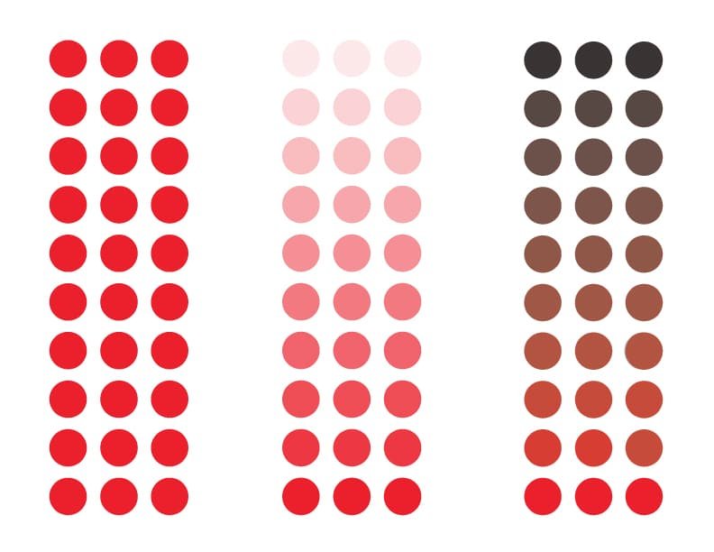
A tint of any color is when you take a color and add white to it. A tint of a color is anything more than white with a color added. For example, if we use green, and only add 1% of green to white, it is still a tint of green.
A shade is when you add black to any color. Using green as our example again, any color with black added all the way up to 99% is still considered a shade of green.
Cool colors

Warm Colors
Understanding warm and cool colors is essential for driving a lot of emotion. Having a warm or cool color scheme can have a drastic effect on the mood of any image or design. Think of an image of a meadow with a lonely tree. If most of the colors are bright green, with tints of orange, yellow, and even close to red, such as a fiery sunset, you get a sense of warmth like you would from a sunny day. However if there are none of these colors and you use all blues and violets, you would get a sense of cold or coolness as you would from a winter day. Colors are also tied with emotions, which we will talk about in our next post.
Color Theory: Conclusion
Before you can understand colors and emotions, you have to understand how different color combinations work. Understanding the science behind colors and how they work together is an important foundation for understanding color meanings and emotions that are tied with specific colors.
Do you have any questions about color theory? If you have anything to add about color models or how colors work together, feel free to post your thoughts or questions in the comments section below.


Hi! jgeorge great article. Very true we should understand first how different color combinations works. In branding your business or designing website we should pick the right color to get attention on our target audience. If Colours are used in the right way, your business will see an increase of revenues and profits