Web Design Trends
There are certain trends that you may be absolutely tired of seeing, but the truth is, trends exist because they are popular. To ensure that visitors approve of your site, and return to it, you have to make them visually pleasing to mass audience. You, as a designer, have sophisticated taste, but it’s important to cater to the larger audience as well. There’s a delicate balance you must strike between maintaining your integrity as a designer, and being a total sellout. Here are a few 2014 trends to keep in mind.
Radiant Orchid
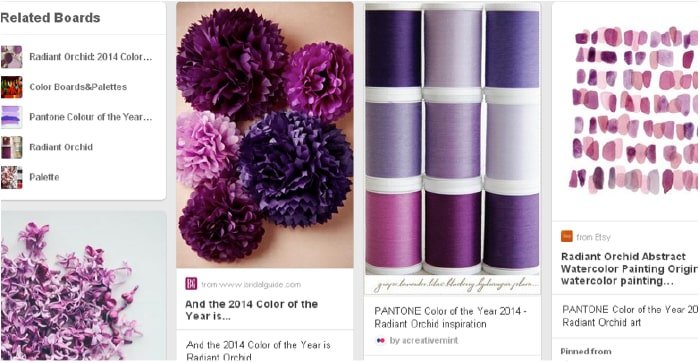
Pantone Color of the Year 2014 is Radiant Orchid, and whether you like it or not, the color has infiltrated into every single aspect of our world, be it fashion, cosmetics, art, or design. Last year’s color, Emerald, also became a huge trend for 2013, and this year it’s shades of purple, lavender, and mauve. You can’t escape it, so might as well embrace it. The truth is, adopting these colors and incorporating them into your palette, even subtly, can make you seem up-to-date, fresh, and current. Obviously, anyone would choose Radiant Orchid over Mimosa (the color for 2009) just like you would pick Helvetica over Comic Sans.
Hipster Logos
2014 is the year of the hipster. Whether you sport a non-conventional beard and sit in flannel all day, or are the most basic of basics, the truth is undeniable; people love hipster logos. It presents something more raw and down-to-earth, and differentiates your site from more bourgeois brands. It’s simple, clean, and vintage. Remember vintage is the key word when talking about anything popular in 2014. Lana Del Rey’s style is vintage, this car is so vintage, I love the vintage feel to this place, and so on. Hipster logos automatically elevate your cool status, and visitors feel as though they are on a very trendy site, and are sure to return. Hipsterlogo.com has a great design guide you can try out.
Bold Typography
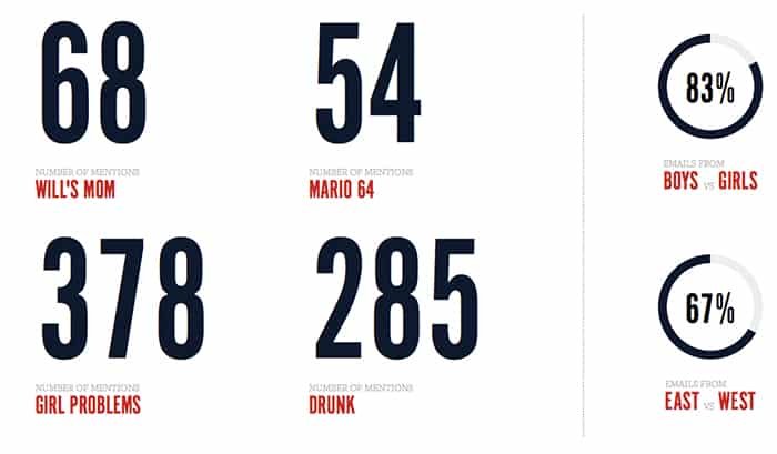
Nobody likes squinting to read the copy on your site. Bold typography and large content blocks allow you to add a playful touch to your design while maintaining your minimalist structure, as well as allows better functionality. If your readers can actually read the content, they’ll be happy with the design. Bold typography is all about making a statement. In 2014, we’re obsessed with statements, and how better to make it than by using a huge, in-your-face font that nobody can avoid. It attracts attention, and adds to your trend points. What could be better?
One Page Design
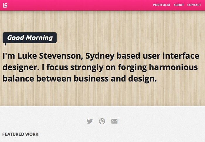
One thing that has become popular as of late is the one page website design. With this concept, designers are stacking blocks of content on top of each other. Instead of separating content into different pages, they are putting it all on the first page so that users only have to scroll down to see what’s on the website. I’m not crazy about this trend because of the search engine optimization problems it can cause, as well as the lack of exploration that this method promotes. However, some designers do it well, like Luke Stevenson, with his portfolio site. The site is short, simple, and to the point.
Parallax Scrolling & Effects
Parallax scrolling is another popular trend right now. While I find this trend to be a little more interesting, it seems to be overused by a lot of people. Don’t get me wrong, it has its place. This is especially true in websites that are guiding you through a process, or has information that should be read in order. However, just because a trend is popular doesn’t mean you should use it on your website. I do like it when designers add transitions and effects on top of the scrolling effect. This makes your site enticing to explore, and it promotes interactivity as well. House 207 has an awesome site that really gets your attention with big, bold type, scrolling effects and animation.
While it’s important to incorporate trends into your work, also remember to maintain your own personal style, which has got you so far in the world of web design. A perfect mixture of those two should give you an excellent site that is functional, beautiful, and very trendy.


