
Twitter Drops Helvetica Neue For Gotham
It’s one of those things you hear via the buzz on the internet. Twitter, a great source for news (when you filter out all the garbage tweets an harassment), decided to change it’s long-time font choice from Helvetica Neue, a great font choice by the way, to Gotham. The question that comes to my mind is: why? Let’s compare the two typefaces, and maybe we’ll get an idea of why they made the switch.
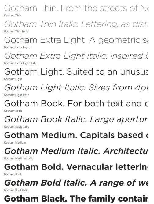
Gotham
Helvetica Neue
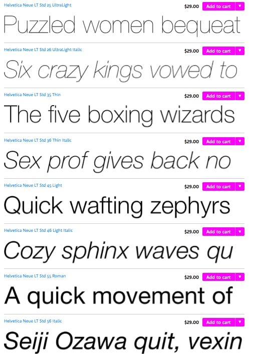
If you look at both fonts, they are very similar. They both have a huge collections of weights, from light to Ultra, and Black versions, they both have a lot of variations to choose from. At first glance, the differences are subtle, but not enough to be a reason to switch as a design choice. Let’s look at a couple of differences:

Notice the tail on the a. Gotham is straight, and Helvetica Neue’s tail is curved. Also, notice the counter (the rounded part of the a) – It seems sunken in Helvetica Neue, and Gotham’s is more rounded.
The Numbers

Notice the number one. Gotham’s is more streamlined, Helvetica Neue’s is almost like a rounded serif. The two of Helvetica Neue curls around, and Gotham’s is more of a U shape. There’s also the curve in the 2, where Gotham has more straight lines. You can especially see this in the number 3.
Helvetica is condensed(slightly)
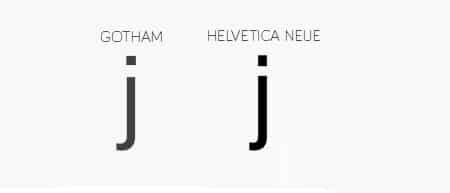
By looking at the j, you can see that Helvetica Neue is more condensed and stretched vertically. The dot over Gotham’s letter j is more square.
Alignment
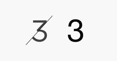
If you look at the number 3, you’ll see that many of Gotham’s stems and strokes align, which gives it a more balanced appearance. Helvetica Neue’s curves seems to curve too much. At smaller sizes, I could easily see a number 3 being mistaken for an 8, doe to the closure design principle. This can be a problem for Twitter, especially since so many people view, access, and tweet via mobile devices. According to thenextweb, 76% of Twitters users are mobile users. This means that Twitter may have been looking for a more mobile-friendly typeface for its majority of users.
Conclusion:
Twitter traded in Helvetica Neue for Gotham, which I think was a good decision. At first, I was like everyone else, wondering “why?” However, after I did a side-by-side comparison of the 2 typefaces, I realized why they made the decision to go with Gotham. They get the versatility of having tons of weights, italics, etc., while getting a ore streamlined look. Gotham and Helvetica are similar in some areas, but there are a lot of apparent differences that are aesthetic improvements.
What do you think? Do you like Gotham over Helvetica Neue? If you want to add Gotham to your repertoire, it comes at a price tag of $300 for the entire collection via Hoefler & Co.


Well Jgeorge, thank you very much for the comparishment. At first I was like what. Why? After I read your Article it made sense to me too. After that I relaised – I’m using Carbon a third party app. So it doesn’t affect me but still a nice to know.
Mike, I think a lot of people are like us. I had to know why. It just didn’t make sense until I made a professional comparison of the 2, and then it all came together. I am glad you enjoyed my article and thanks for taking the time to comment.