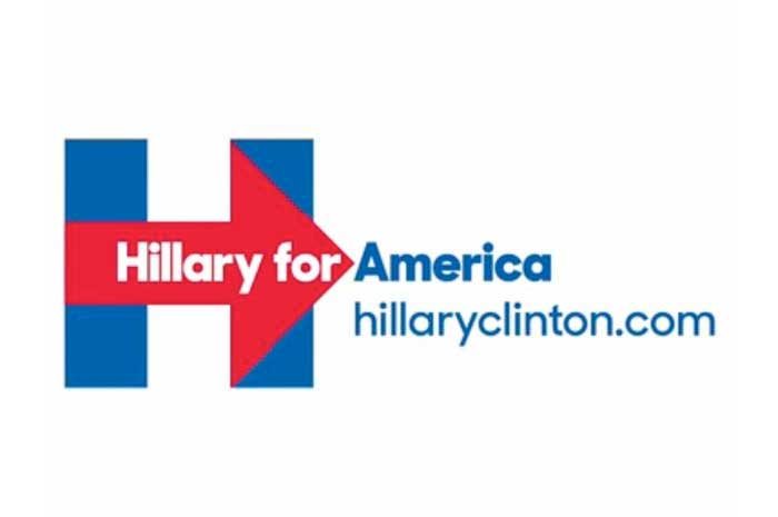
The Hillary Clinton Logo
It’s easy for everyone to jump on the bandwagon about a particular subject. The problem as, a lot of people have jumped on the bandwagon, when I don’t think it’s necessary. The bandwagon I’m talking about is the Hillary Clinton logo debacle. For some reason, everyone is attacking the Hillary Clinton logo like an angry mob. While I don’t think that the Hillary Clinton logo was the best logo design of ever seen, it certainly isn’t the worst. Let’s take a look at the Hillary Clinton logo and decide for ourselves whether it is a failure or success.
First off, conceptually it’s not that bad. It’s not effeminate, and it’s certainly not cliché. The H is a very strong typeface with bold strokes, which represent power and strength. Built into the logo is an arrow pointing forward. This is better than the typical Stars & Stripes idea that everybody seems to always throw together. We get it, this is America, but I think we can move past stars and stripes for every political logo ever. The arrow pointing forward represents progress, which is something I think that this country needs.
The arrow and the heavy weight of the H itself gives you a lot of room to insert type or messages within the logo. The only thing that bothers me about this logo is how the red and blue compete with each other. I think that a little bit of white space, or maybe I white stroke around the arrow would break up the competition between the red and the blue. It doesn’t have to be much, but it would help to break things up a little bit.
For some reason, many designers are attacking the new Hillary Clinton logo, like angry townsfolk after Frankenstein. This logo isn’t really a monster, and just just getting a bad rap, which is unwarranted. I could see if she’d used hot pink or some strange effeminate typeface. However, I think that the heavy weight font was the right choice. Hillary Clinton is a dominant individual and a strong leader. Therefore, the Hillary Clinton logo should have a dominant presence, which it does.
Conclusion
I don’t think the Hillary Clinton logo deserves all of the negative publicity that it’s receiving. Like I said before, it’s not the best logo I’ve ever seen, but it’s certainly not the worst. At least it looks like someone put some thought into it in terms of concept. What do you think about the Hillary Clinton logo? Do you like the new logo design, or do you think she could have done something better? I love to hear what you have to say, so leave your thoughts in the comments section below.


I agree with you James that the Hilary Clinton logo isn’t the worst ever; there’d be plenty of competition for that particular prize. It may even tick a lot of the boxes; not effeminate, no stars and stripes, and it avoids various other cliches that usually get incorporated into campaign symbols.
What is blindly apparent though is that it’s terribly dated. One of the first – and maybe unjust – criticisms was that it ‘borrowed’ the FedEx arrow. This made me wonder when the FedEx logo was created, and I discovered that it was in 1994. If I knew nothing about it I’d have placed Clinton’s solution at least 20 years before that: a typically crude and clumsy piece of 70’s design.
I say this without prejudice: I’m not an American citizen – and therefore possess no voting preferences – and actually have a soft spot for Bill and his wife.
This logo is just too commanding with the arrow. it’s like a logo for some local insurance company or car wash service. If I were American, I wouldn’t feel the tiniest bit of patriotism seeing this logo. It’s not a logo for someone running for presidency. It’s awful, it doesn’t apply to your emotions, it’s just pure authoritative, fantasy-less call to action.