About Paula Scher
When you think about great designers and those who produce great design, Paula Scher should be among the list of designers you mention. Her accomplishments in the field of graphic design are extraordinary. Here concept driven designs are smart, elegant and powerful. She is currently a partner at Pentagram in New York, where she has created design and branding solutions for several major corporations, including Citibank, The New York Times Magazine, Jazz at Lincoln Center, The Public Theater and more.
Paula Scher: Accomplishments
When you go into listing Scher’s accomplishments and her history, you almost don’t know where to begin. There’s so much that she has contributed to the design industry and important cultural aspects of New York. She was awarded the Beacon Award for her identity work with The Public Theatre. In 2000 she received the prestigious Chrysler Award for Innovation in Design. She served 2 years as the President of the New York Chapter of the AIGA. She also received the AIGA medal for all of her amazing accomplishments. She has also been inducted into the Art Director’s Hall of Fame.
Paula Scher: Her Work
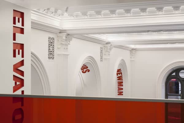
Paula Scher’s work is inspiring and shows the thought and depth that goes into everything she does. Her most famous work is the work she did for The Public Theatre. What I think is most interesting about her work is that it isn’t just flat. Her work is applied environmentally, too.
Just look at how the different areas are labeled, and it is a part of the architecture. The classic architecture meets modern design, for a beautiful and elegant experience.
Jazz at Lincoln Center
Simplicity at its finest, the jazz logo looks like an old record, with the stem of the a as the needle that plays the record. This shows true mastery in concept and execution.
Look at how the design is applied environmentally to the elevator doors. This is branding applied to your surroundings, which is pure genius.
Swatch
The Swiss watch ad is created in her signature constructivist-inspired style. There’s so much to look at, and it’s a truly classic design.
Windows
Anyone remember the ugly Windows logo that was supposed to be dimensional? Well, it was streamlined, and the window edges were straightened. What a great solution, while still keeping the branding recognizable. The updated logo brings Windows out of the 90s and into the modern world.
Paula Scher: Conclusion
Which of Paula Scher’s work is your favorite? I would have to say it would have to be the Jazz design. It is concept driven, beautiful, and really captures the essence of the genre. If you get a chance, you should follow her on Behance. Also, just studying her work and her approach to graphic design will make you a better designer. For more information about Paula Scher, here are a few good sources:
Paula Scher and the Geography of Design


I like the Jazz motif, although my first thought was that the ‘a’ was based on the original symbol for a microphone (that particular style being known as a ‘ball & biscuit’).
On second glance, now I’m wondering if the squared elements are a tad oxymoronic. (Is that a word?)
BG, I thought it was made to represent old school record players, which I always imagined jazz music being played on. It’s interesting how we both have a unique take on this, depending on our own personal experiences.