Simplicity tends to be the key to success, especially in graphic design. In a world polluted with so many grey areas, it is nice to have something that is black & white. Negative space is just as important as the object that it surrounds. We’ll take a look at negative space and why it is so important to graphic design.
What is Negative Space?
Negative space is the empty space that surrounds an object. Negative space defines the boundaries of an object, which helps with distinction and definition.
Negative space is important for defining shapes. Think of your favorite typeface. Is it legible? Do you know why it is so easy to read? My first guess is because it has a good balancing of negative and positive space. When a typeface lacks this type of balance, it can be difficult to identify each letter, especially at small sizes. This is why Helvetica has reigned supreme for so long as a popular typeface. It is easy to read at large and very small sizes.
Negative Space Vs. Positive Space
When negative space and positive space compete, this is typically called figure/ground. Using this concept has sparked many logos and designs where you see dual images. You can see one image in the positive areas of a design. Then, when you focus on the negative space, you may see something completely different. There are tons of examples where this principle has been used in logos. Let’s take a look at a few examples of clever use of negative space.
This is a brilliant use of negative space. The outer portion of the letter E is smooth and round, while the inner portion is finished off with the simple shape of the opening of an elephant’s trunk.
VinoPiano is another excellent example of competing positive and negative space in a design. In the positive area, you can see three wine glasses. In the negative space, you see black and white piano keys.
Dig is another great example of the simple use of negative space. The counter in the letter D is the spade of a shovel, while the counter in the G is the handle. The space spanning across the eye separates the stem from the dot, making it easy to read and consistent.
A little more complicated, but not too much is the logo for circus of magazines. The logo uses positive and negative space to create dual imagery. The positive areas look like the pages of an open magazine. The negative space also competes with this to form a circus tent.
Negative Space is Also Utilitarian
We’ve looked at the creative use of negative space, but it’s important to also look at the practical use of negative space. You can also think of negative space as breathing room. Just because you have an open, blank area, doesn’t mean you have to fill it. Milton Glaser said it best when he said “Just enough is more.” In other words, don’t add any unnecessary elements to your designs.
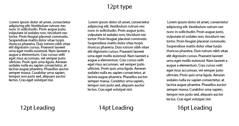
Negative space is also used in typography. It’s needed for legibility and readability. When lines of text are too close together, they become difficult to read. This is called leading. The more leading you give your text areas (within reason), the easier your text will be able to read. The negative space helps to break up each line and keep you from reading the same line over again. Just be sure not to add too much leading to your body text, because it will make it difficult to read, too. The typical amount of leading you should apply to text is 1.2 times the point size of the text.
You can see from the text above that when you add more leading to the text, it is easier to read and appears more elegant. The font is Myriad, and in this case, I think the text looks better with 16pt leading at a 12pt type size. This just goes to show that you have to assess each type situation at case by case situation.
Conclusion
Negative space is an essential part of any design. Negative space is just as important, if not more important than the positive space. You can use negative space to your advantage to create a beautiful design that is clever and eyecatching, like the ones I showed you earlier in this post. Have you created a logo with a clever use of negative space? If so, I’d love to see it. post a link to it in the comments section below.


