With all of the free fonts out there, it can be hard to weed out the ones that aren’t so great. It seems like every week someone is coming out with a new typeface. Don’t get me wrong, some new typefaces are excellent, but it can be the same as finding a needle in a haystack. Serif fonts are a staple of any professional designer’s toolkit. Classic serif fonts are extremely useful for your designs, because they have stood the test of time. I have put together a collection of classic serif fonts to use in your design projects.
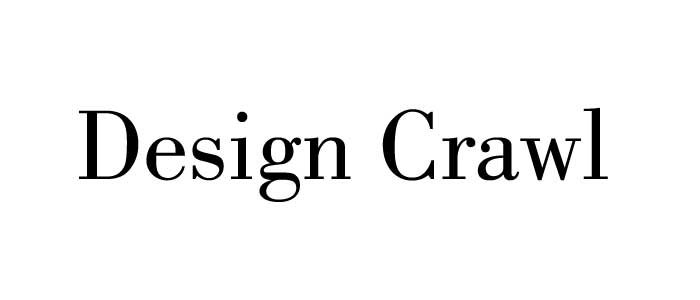
Bodoni
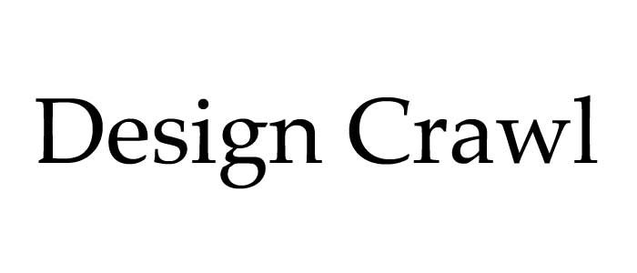
Garamond
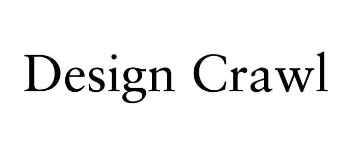
Baskerville
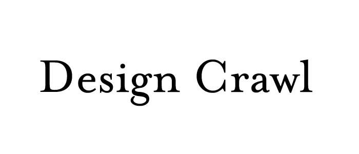
Caslon
Palatino
Sabon
Mrs Eaves
Times
Centaur
Bembo
You can see from the previews of each of these classic serif fonts, that there are plenty of differences in each one. Differences can range from the bowls of certain letters or even the x-heights of each typeface. Each font can have a different x-height, which completely changes its look and presence. other differences in each of these fonts can be the shapes of the serifs. Some can be flat, such as what you see with Bodoni. Others can be rounded, like what you see with Bembo.
You’ll see other differences, too, such as the variations in thickness of certain strokes. Even the crossbars of certain letters can be different. Notice how the crossbar of the lowercase e is different in Bembo and in Centaur. In Bembo, it is horizontal. However, in Centaur, it is angled.
Conclusion: Classic Serif Fonts
These 10 classic serif fonts are excellent for creating great design work. They have stood the test of time, and can always be considered elegant choices for any classic design. Which one of these classic serif fonts are your favorite? I have always loved Sabon, especially its italic version. I would love to hear your thoughts on these great typefaces. Please leave any thoughts or questions you may have in the comments section below.


