Typography Examples
I love typography and intricate lettering. I just can’t get enough of inspiring typography examples, which can be found all over the web. This is the fifth installment of inspiring typography examples. You’ll see some of the most awesome typography examples on the web. From creative uses of negative space, to truly innovative work, there’s something for everyone in this post. Let’s take a look at 14 typography examples you won’t want to miss.
Blown Away
I love the concept behind this! You really get a sense of the power behind the mower in a visual way, and it’s all done with typography.
Environmental Type
Think about how much planning had to go into this piece. This had to be pre-cut out of raw materials and then applied to the wall.
Anagram
I’ve always thought that words that can be flipped were visually stunning pieces of typography. You really get a sense of the word, because you end up turning your head to see it both ways.
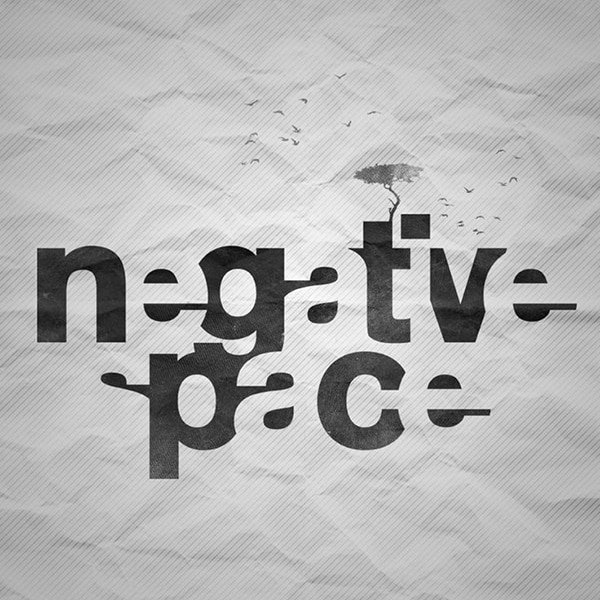
Negative Space Type
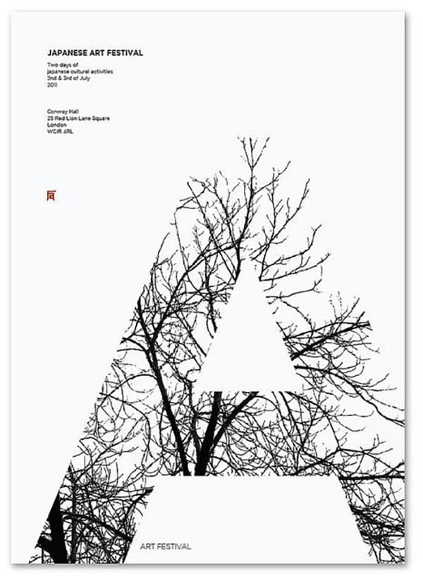
Using only what you need and trimming everything else way is one of the most effective parts of design. There’s nothing else extra here, just pure positive and negative forms.
Ribbon Type
Sure, you could create a typographic piece with fonts, but when you create them from materials that are associated with the event, the effect is much more prominent.
Runner Type
Visually and emotionally, this piece is so compelling. You get the idea that while you’re running, everything else, such as your problems, worries, and anxieties just see to melt from you. It’s just you, and the pavement.
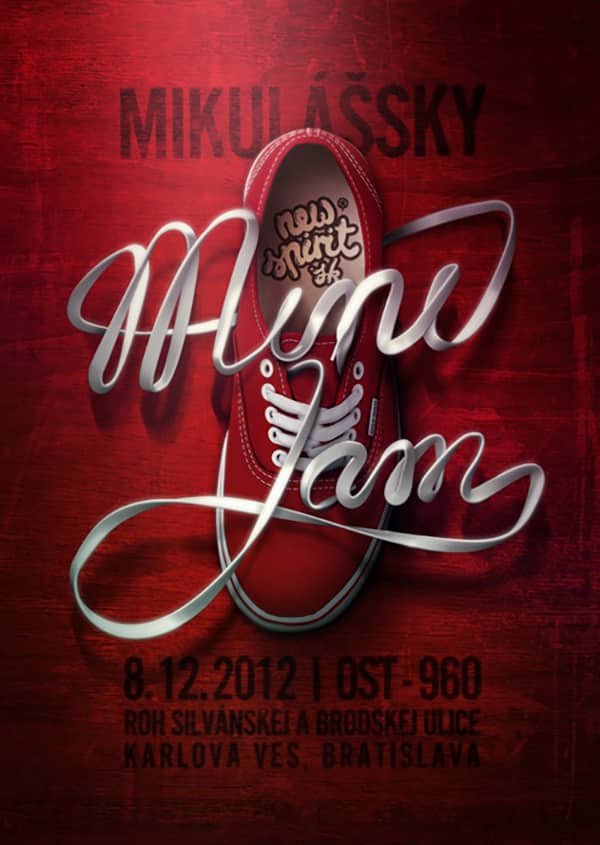
Creative Shoelaces
I’m sure this is Photoshopped, but the use of light and shadow on the shoelaces is a work of art itself.
Architecture Letters
Think about how much effort went into finding skylines that formed letter shapes. This is one of those typography examples that you know it had to take time to make.
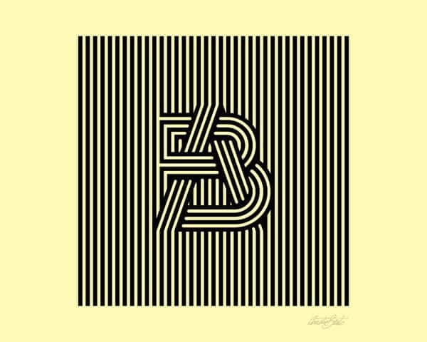
Optical Linear
It’s tough enough to get the lines to line up properly, but to create letter forms within them takes this design to a whole new level.
Jazz Type
This is a ingenious promotional piece for a Jazz artist. Making the lettering from the instrument itself makes a powerful statement.
Photo Cropping
Other than the design principle of continuity, there’s nothing else that tells you where the letter ends and the background begins. It was essential that the letter was easily recognizable for this to work.
Letter Imagery
Using a letter from the title to form an image of what it’s about? You can’t get much more iconic than that.
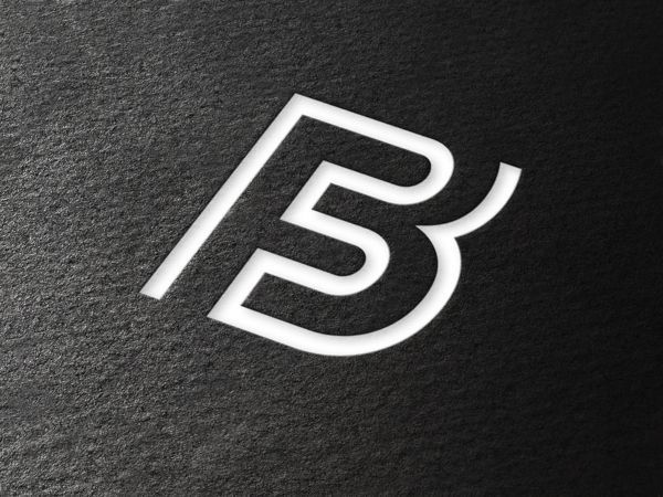
F3 Simplified
Extremely simplified letters have come together to create a unique insignia. This makes a powerful statement, anywhere you put it.
Watercolor Calligraphy
I love this, just for the fact that it is a mix of precision calligraphy and imprecise watercolor. My guess is that they used something like wax to block the watercolor from the paper, and then peeled away the wax once the paint was dry.
Conclusion
This week’s collection of inspiring typography examples is a mixed bag of typographic excellence. From mixed media solutions, to illustrative type, this collection has a little bit of everything. Which of these examples is your favorite? They are all so good that it’s tough for me to choose. I’d have to say that the Jazz instrument lettering is the best from this collection. I’d love to hear what you think. Please leave your thoughts in the comments section below.









Great examples!
https://flic.kr/p/6hMtj5
NICE