A New Typeface: Can it be?
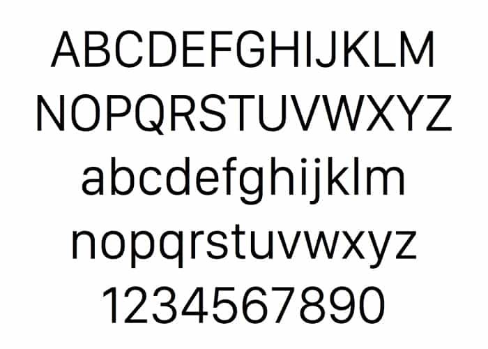
It’s true, and apparently it’s been in the works for 20 years. Now, I doubt they’d worked on it painstakingly all that time, but it make be something they’ve perfected when they had time. San Francisco is Apple’s new typeface, and it’s spectacular. The main thing is that it’s sole purpose is for being easy to read. It’s been developed and perfected for the Apple iWatch. It needed a typeface that could be read easily on tiny screens. The spacing and positive and negative space of San Francisco are superb. I would have to say that it will most likely end up being the most downloaded typeface of 2014 and 2015. Let’s take a look at Apple’s New Typeface, called San Francisco.
Rumor has it that it looks great on all devices, and that Apple with be implementing it everywhere soon. This is exciting, because we’ll be seeing a refreshing look to some regular favorites. On FastCoDesign, they mention the fact that Steve Jobs use to have Apple designers name their fonts after cities, so it’s no mistake that San Francisco is fitting of such a streamlined, optimized typeface. I like the idea that they may be returning to the old tradition. I wonder what other typefaces they may have in the works?
What do you think about the new Apple typeface? San Francisco is a great typeface, complete with several different weights. You’ll find weights ranging from text (regular) to display, from light, all the way through black. You’ll have everything you need to create a balanced design that complies with the new standard brought on by the Apple Watch. In fact, you can download it for free and try it out already!
Download San Francisco Now!
All you have to do is click the download link to access all 23 versions of Apple’s San Francisco & start using it today!


