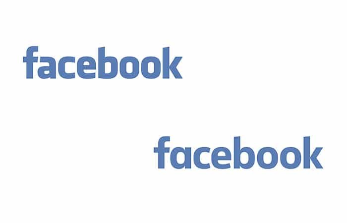
The New Facebook Logo Vs. The Old One
I found out late last week that Facebook was updating their logo with a more “friendly” version, which immediately made me gasp. There are few brands as iconic as Facebook, so I immediately thought ” Well, this had better be amazing, or this must be some kind of joke.” Well, it isn’t April, so I don’t have to worry about April Fools Day, so my curiosity was piqued. I had to see the new Facebook logo.
So I took a good, long look at the new logo. My immediate thought was “generic”. I’d love to have a piece of the pie for whoever had the pleasure of redesigning this. I doubt Facebook paid anything less than 100K for the logo concept. My initial thought is “why?” If it’s not broke, don’t fix it. I feel like the new logo is weak and frail compared to the old one. This has to be a hoax or a joke, or something like that. I am really hoping it is.
My Problem With The Logo
The lowercase a looks weak. Where the counter loops into the vertical stem, it tapers way too much. The original “a” was so bold and strong. it looked like it belonged, and the logo as a whole has always seemed uniform. The same goes for the “b”. The tapering is what I don’t like. It just makes it look brittle. Also, the a was essential to the identity, because the crossbar of the lowercase f flowed straight into the a. Now, it’s an abrupt stop.
The two O’s aren’t as strong either. The original had a taller appearance. The only letter in the entire logo that I think is a slight improvement is the “c” because it seems more open and natural.
My initial thought upon seeing the logo is that someone tried to emulate the Facebook logo with the wrong typeface. I am hoping that if this is real, they are just testing it, as they take a step back with their hands up saying “just kidding.”On this one, they can tiptoe backwards silently from the room.
What Do You Think?
I’d love to hear other designer’s points of view. Feel free to chime in with your own thoughts. They can be likes, dislikes, or both. Please leave your thoughts in the comments section below.


It is true. They changed the logo.
You dislike the new logo because you’re familiar with the old logo. If the options were reversed, and you have been seen the new logo for an extended period of time, you would likely complain similarly about the old logo. The real question is whether they really needed to change the logo or not — however the fact of the matter is simply that the logo for facebook doesn’t matter. Facebook itself matters. The logo does not affect the product.
Wondering if it even matters? I searched and searched for an application of the Facebook logo… everywhere I look I only see the “f” icon… no logo with the entire Facebook word… even when I googled Facebook, the only place I could find their logo were on sites where designers were talking about how much they hate the new logo. Even on their assets page, the “logo” is described as only the “f”. https://www.facebookbrand.com/
So maybe the joke is that this is actually never or rarely even used?
You know Maggie, that’s funny and it’s probably true. I have barely noticed it used, too. All things are tolerable in small doses.