3D Typography Examples
It’s hard enough to create gorgeous type on a 2 dimensional plane. Imagine creating a typographic composition in 3D! That adds a whole new dimension to our work (no pun intended). I have put together a collection of some mind blowing 3D typography to inspire you and get you thinking about type in new ways. Let’s check out some killer 3D typography, shown below.
Whether you create 3D typography on the computer, or you layer materials together in real life to make real 3D type, it still gets your attention. The scroll type, combined with the glossy text, really jumps out at you.
The 3D wireframe text is a great wall accent that builds and reinforces brand recognition. I have seen a lot of businesses do this. It has more of an effect than simply hanging a poster or graphic on the wall.
This wood typography has a precision look, while still having an organic look. Personally, I like the version with more vibrant colors, which seems livelier than the other example.
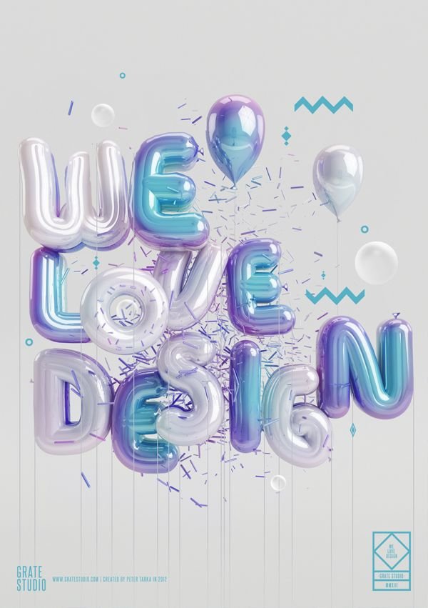
This 3D balloon typography is amazingly executed. I love the gloss, which perfectly executes the glossy balloon look. Combining that with the floating confetti shapes was a good idea, because it creates a great sense of visual contrast.
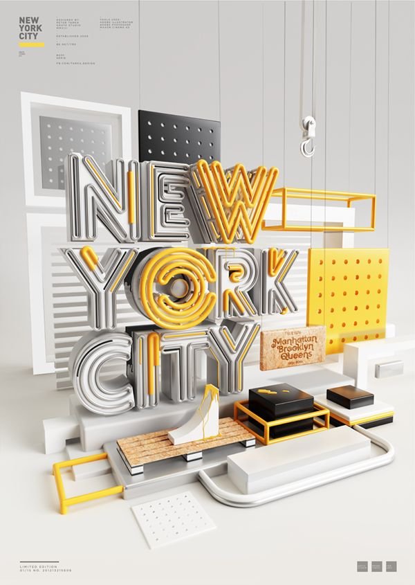
This poster is an excellent example of 3 dimensional type. The entire design looks like a creating scene, like a diorama or a scale model. There is a great mix of colors, textures and shapes, which makes this poster interesting to look at.
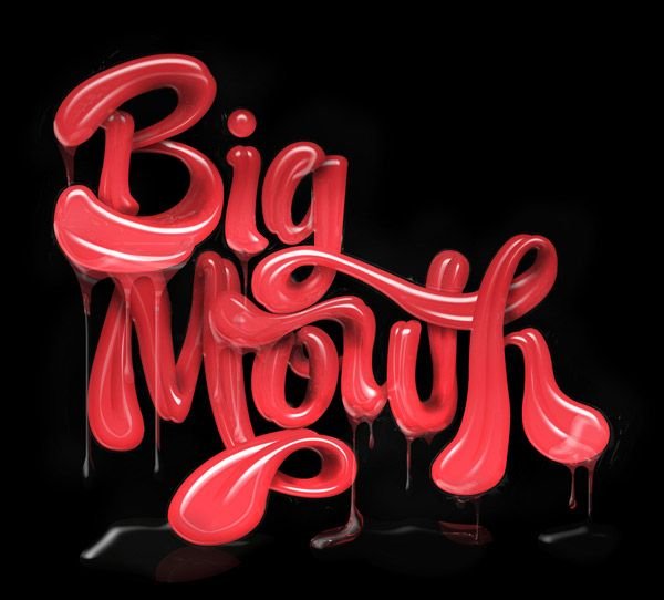
This text is absolutely mesmerizing. Everything is perfectly executed, from the glossy wetness of the tongue-like surface, to the wetness of the dripping saliva. If this design doesn’t get your attention, nothing will.
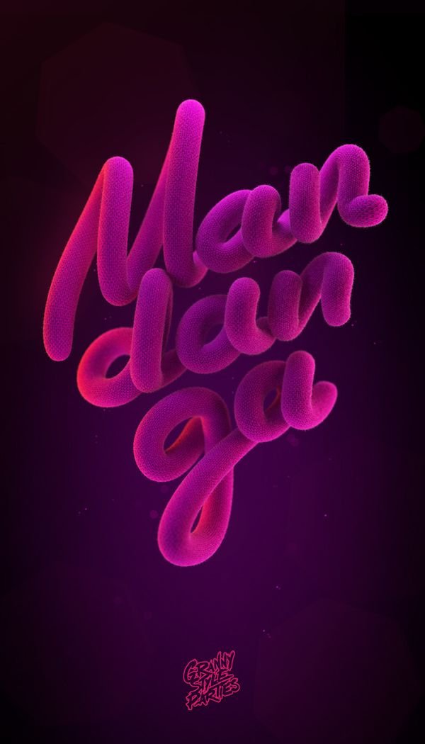
The part about the poster above that makes it stand out is the contrast in colors between the pink and dark purple background. The texture adds a little something extra than if it was just a smooth surface.
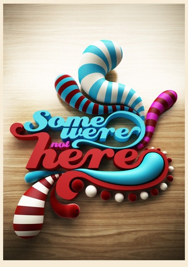
In the example above, I love the roundness of the stripe sections, and the flatness of surface of the letters. This contrast is what makes this work so well.
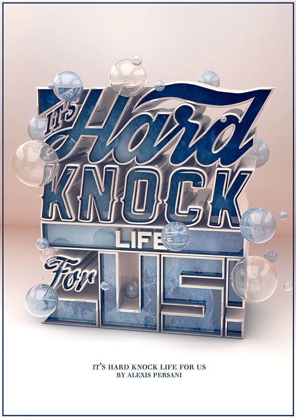
The 3D stacked text is excellent. I love the inlaid marble texture, with the glossy metallic trim. Combine that with the round, glossy bubbles, and you have a unique and fun 3d typography design piece.
This is a great example of combining 3D type with objects to create a great digital scene.
I like this one because of the layered effect, with a multitude of surfaces. I only wish they would have done a little something more with the 2. It is flat and seems out of place.
I love how the designer mixed the different layers of colors, textures, and neon lights to create a great looking poster.
Conclusion
This is a killer collection of 3D typography that should leave you feeling inspired and ready to create your own. Which one of these is your favorite? I’d love to hear what you think. Leave your thoughts in the comments section below.


