Type Inspiration
It’s been a while since I put together a collection of type inspiration, and this collection will blow your mind. These examples transcend simple kerning and leading. They venture into areas where some designers dare dream of.
Handcrafted Amazement (Tom Boy) by Spider Money
Spider money definitely has his craft nailed down. Every line is clean and crisp, and you can easily read every letter. I can’t believe this is done with markers.
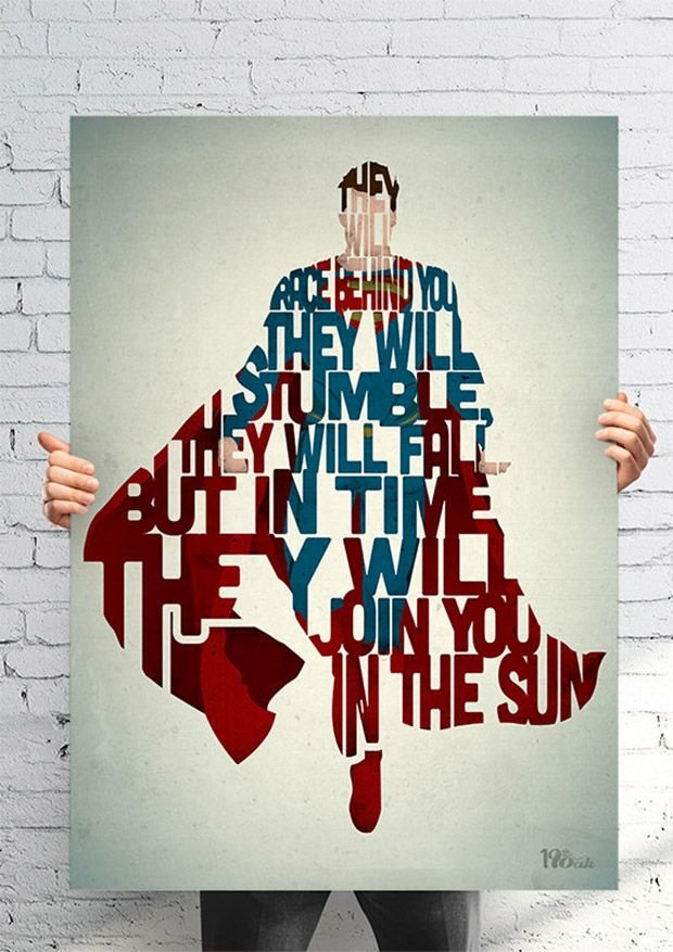
Superman Typography
Who doesn’t love superman? Not only can your read each poster created this way, they’ve created a multitude of movie characters this way. You’ll have no trouble identifying each one.
1976 Poster
A little nostalgia is always a good thing. These classic colors, mixed with the large round numbers gives this a retro feel.
Barcelona Dimensional Poster
It’s one thing to create type and creative lettering in two dimensions, but when you start layering and composing in 3D, it takes your work to an entirely new level.
Typography & Logos By Tomasz Biernat
These are more typographic logos and emblems than you can shake a stick at. They are al carefully hand crafted and well executed, all in one massive collection!
Balloon Typeface 3D
I love 3D when it’s done well. These letters definitely have that rounded, glossy balloon look. What a fun way to create a party poster!
Salida Winterfest Poster
I love how the type breaks up the wine glass, but you still get the idea anyway. The type is fun ad elegant at the same time.
Getxophoto Poster
I don’t know if they cut this out of paper and then photographed this, or if they did this in Photoshop, but I love it either way. The colors pop against the white letters and shadows.
Simply Genius Type Examples
What a clever selection of type ideas! I really like how the idea is reinforced with shapes and bending the type itself. It’s simple, yet effective.
Illustrated Type
Believe it or not, this goes on a t-shirt. It’s illustrated with a distinct style which only makes it better. I like how they used an arrow as an underlining element.
Something Beautiful 3D Type
Mixed media is a great way to get creative. The fact that each word is made of something different gives it an organic feel.
Chill Negative Type by Jordan Metcalf
This is really simple, but it works. It’s either chalk or white pastels on black paper, and the medium is used as the shading element for giving it the 3D look.
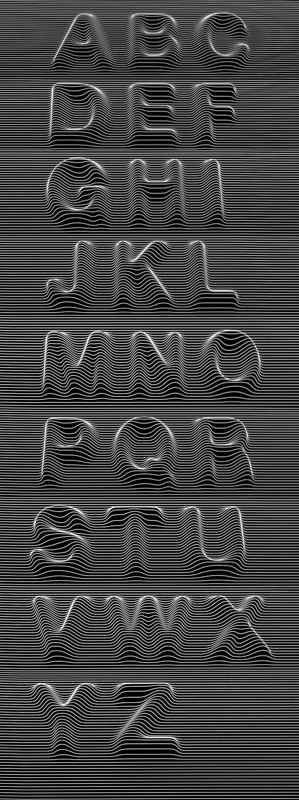
Kwerk 3D Linear Type
This one blows me away, because I can only imagine the time that went into bending each line to form each letter. This took some work, and it’s even consistent!
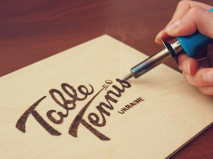
Burnt Wood Table Tennis Logo
This is lettering burned into wood. I don’t like the idea of anything that you can’t undo. This takes patience and time to hone your craft.
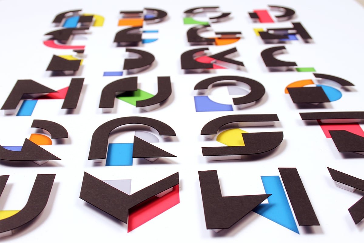
3D Paper Type
What an interesting way to create type. It’s a mix of flat color, and paper cut into specific shapes and placed into a dimensional form with spacers.
Conclusion
I don’t know about you, but my mind is blown by this amazing collection of beautiful type and creativity. Each example is a great showcase of thought, and craftsmanship. My favorite would have to be the Tom Boy example, or the Balloon Type. Which example is your favorite? I’d love to hear what you think, so please leave your thoughts in the comments section below.


